Realist Portrait Painting Techniques, From Value to Finish
The techniques realist portrait painters use form a sequence, not a bag of tricks. See in values, find the shapes under one light, mix from a balanced limited palette, model the planes, control the edges, finish to complete. What each one is, and where it is taught in full.
Ask a realist portrait painter which techniques they use and the honest answer is an order, not a list. The order is the technique. You see the head as a few values before you touch color. You find its shapes, the shadow shape first, under one light you decided on. You mix flesh from a small balanced palette instead of a large one. You model the planes only after the flat shapes are right. You choose which edges stay hard and which dissolve. And you stop when the picture is complete, not when it is polished. Each decision sets up the next, which is why a portrait usually fails early, in the block-in, and not late in the rendering. This guide takes the disciplines one at a time and links the lesson where each is taught in full. The whole curriculum is the map behind it.
None of it is mysterious, and none of it is a trick you can bolt onto a weak drawing. It is a sequence a working painter runs every time, and the reason the sequence matters is that the early decisions are cheap to change and the late ones are not. Spend your attention where it pays, at the front, and the finish mostly takes care of itself.
Seeing in values
A portrait reads from across the room or it does not, and what carries at that distance is not color and not the count of eyelashes. It is the pattern of values, which shapes are dark, which are light, which sit between. So the first technique is to stop seeing a face and start seeing that pattern. Squint hard at the subject and the detail drops away. What survives the squint is the value structure, and that structure is what you paint first.
The scale gets compressed into three brackets. Darks, mids, lights. Three families, and each one has to hold together as a family, because the eye sorts a picture into light and shadow before it reads anything else. A note that belongs to the shadow but drifts up into the light family gets filed as lit, and the form breaks at exactly that spot. This is why a well-drawn portrait can still look wrong. One value in the wrong bracket and the head stops reading as solid.
Value is also relative, which is the part that trips most people. The same gray reads lighter on a dark ground and darker on a light one, though the pigment never changed. A dark object in the light can measure a higher value than a light object in shadow. So you are never matching a value in the absolute. You are managing how each note sits against its neighbors, and one line polices the border between the two big families. His tongue twister: "The lightest lights in the shadows should be darker than the darkest darks in the light." Hold that and the shadow family keeps registering as shadow, even next to the dark mid-tones. Cross it once and the two families start trading members.

The practical habit is to keep the shadow flatter than the rest of the painting, held close to one value, with any stray lights inside it averaged down until the mass reads as one shape. A shadow with light scattered through it stops registering as shadow.
One more habit fixes the range at the start. Find your darkest accent and your lightest light in the first session, usually a pupil or a nostril for the dark, a single note on the forehead or the nose for the light, and place both early. With the two poles pinned, every value in between gets judged against them, and the painting stops drifting lighter or darker as you work. The full lesson, with the two-part exercise that builds the eye for it, is Seeing in Three Values.
Finding the shapes before the form
Once you can see the value pattern, you draw it as shapes, and you get the shapes right before you model any form. This is the technique most beginners skip, and skipping it is why their rendering does not save the picture. A carefully modeled eye in the wrong place still has to move, and when it moves the modeling moves with it. So the hours spent rendering it were spent twice. Solve the shapes, the distances, and the proportions first, while they are cheap to change.
Shapes have a rank. In his words, "The largest shapes are like continents, then you have countries, then states or regions." Two or three continents carry the likeness and the composition. The countries live inside them, the regions inside those, and none of them have to fit together like puzzle pieces. Get the continents right and the sitter is already recognizable before a single feature arrives, because the likeness rides the largest shapes, not the details.
Under one light, the first shapes worth trusting are the shadow shapes. The border between light and shadow is drawn by the light itself, so it holds still while everything else stays negotiable. That makes the connected shadow shape the anchor of a portrait, the thing you measure the rest against. Keep it as one flat shape, one value, and it holds the whole head together. Break it into islands and you are recording your habits, not the light.
The standard for this stage is deliberately loose. "As accurate as necessary, not as accurate as possible." Accurate enough to trust for the rest of the painting, and no more, because a block-in polished past that point is just early rendering waiting to be moved. The integrity of the larger relationships is what keeps the piece together, and it is hard to establish later, so the earlier you lock it, the better the whole painting goes.

Bargue's nineteenth-century drawing course turned this order into a syllabus a century of academic painters trained on: the straight-line block-in first, the refined outline second, the finished tonal drawing last. Most portrait painters check the big distances with a tool held at arm's length rather than trusting the hand alone, the width of the head against its height, the drop from the brow to the base of the nose, the tilt of the eye line. The measuring is not the art. It keeps the honest shapes honest long enough to build on them. How you compare those proportions, by eye or with a measuring method, is its own decision, taken up in the FAQ below. The full lesson is Shape Before Form.
One light draws one border
The shadow shape can only anchor a portrait if there is one shadow family to anchor to, and that is a lighting decision made before the first mark. One light draws one border. Everything in the scene lands on one side of it or the other, so the picture sorts into two connected families, a light shape and a shadow shape. Add a second source and you add a second border. The families break into pockets, and a pocket anchors nothing. This is why two lamps on a face, or a lamp fighting a window, is the fastest way to make a portrait look amateur. The shadows disagree about where the light stands, and the eye cannot settle the space.
The shadow family holds only if it stays flat. Let a few notes lighten inside it and they jump out as if they were catching their own light, which reads as an extra light source the composition never agreed to, and the form breaks there. So the technique is to keep the shadow close to one value and hunt down the light pockets. It is the same tongue twister from the value stage, doing its work at the easel.
Choosing the light is also choosing the picture. The same head under north light gives soft edges and long midtones. Under direct sun it gives hard edges and dark, graphic shadow shapes. At sunset the forms fuse behind a warm rim. Under overcast the shadows nearly vanish and the values close up. Each kind of light hands the lead to a different value bracket, so the light you pick is really a choice about which of the three families runs the painting. In the studio this is two dimmable panels on stands; at the kitchen table it is one lamp you can move and a room you can darken.
Caravaggio committed most of his canvas to the dark bracket and let one shaft carry the story. Sorolla made the opposite choice with the same discipline, a field of light with the shadows reduced to small hard anchors, because he chose the hour. Rembrandt shows what a unified shadow family buys at the edges, letting a contour dissolve into the ground while the head still reads, because the shape it dissolves into was already connected. None of them found the light. They chose it. The full lesson is One Light.
The palette for a portrait
With the drawing and the light settled, color becomes a question of the palette, and the technique here is subtraction, not addition. A working palette is balanced, not large. Every tube you add multiplies the mixtures that can clash, and a jarring mixture is far easier to make with twelve colors than with four. His summary: "Cohesion and balance and range is what you need for a working palette." Colors that balance each other, each one earning its place, with enough reach between them to get where the painting needs to go.
The extreme case proves it. The Zorn palette is four pigments, Anders Zorn mixing a lifetime of flesh from lead white, yellow ochre, vermilion, and ivory black, with no blue tube at all. The cool notes come from the black read against the warm colors around it. With four pigments every mixture on the canvas shares parents with every other one, so harmony stops being an achievement and becomes a property of the material. That is the whole argument for a limited palette, seen with nothing hiding it.
His own set sits one step out on the same line: three muted primaries, burnt sienna for the red, ultramarine for the blue, yellow ochre for the yellow, plus permanent rose and phthalo green to push the cooler and brighter notes back in. Rose, green, and white together make what is nearly a warm blue, which buys back reach the muting spent. He treats the set as a baseline, not a law. Prussian blue comes in for painting outdoors, the cadmiums when a sunset or a highlight will not get bright enough without them, a cobalt or cerulean when ultramarine cannot reach a bright sky. The bring-in is deliberate; the baseline stays small.

Two whites finish it, and they are two different tools. Lead white is the transparent one. Glazed in four or five subtle layers over a warm underpainting, the color underneath plus the glaze makes a third color the tube cannot, and that is where the luminosity in skin comes from. One layer looks terrible, so if a flat white is all you need, titanium is the opaque one that covers in a single pass. Lead white is actual lead. It is never a casual material, and a plain highlight never needs it. The two whites compared by behavior sit on the color room, and the reasoning behind the count is in The Balance of a Palette.
One more thing separates flesh from any other subject. Skin has no single color. What you are painting is a warm light cooling as it turns off the form, with the shadow running the opposite temperature to the light. Decide the temperature of your light first, a warm lamp or a cool north window, and every mix answers to that one decision. When flesh goes chalky you added too much white; when it goes muddy you stirred complements into an accidental gray. Pull back to fewer pigments and the color cleans up.
The shadows come off the same short set. Burnt sienna and ultramarine cover the whole shadow range on their own, run warmer with more sienna, cooler with more ultramarine, then glazed over each other toward a deep warm black. Two pigments carry the dark end of a portrait. That is the same subtraction working at the other end of the value scale, and it is why the darks in a limited-palette head stay clean instead of turning to soot.
Form and the planes of the face
Only after the flat shapes are right does modeling earn its place, and modeling is just the flat shadow shape given its interior. Every form under a single light travels through the same zones, and naming them is half the technique. The lit side runs from the highlight, where the surface faces the light most directly, through the halftone as the surface turns away, to the terminator where the light stops. The shadow side answers it. The core shadow is the darkest band just past the terminator, the reflected light lifts the shadow rim, and the cast shadow is what the form throws onto whatever holds it. The terminator is the most important line on the head, because it is where the form turns fastest, and a soft edge there does more to make a cheek feel round than any amount of blending inside the light.
One law keeps that modeling honest. Reflected light lifts the shadow rim but never rises to the value of the lit side. It is the tongue twister again, wearing form language, and it is the single most common place a beginner breaks a head, by letting a bright reflected light punch a hole in the shadow family. A lit rim inside a shadow has to stay inside the shadow bracket, no matter how bright it looks against the dark.

A face is not a smooth sphere, though. It is a set of planes, and knowing them is what lets you model structure instead of guessing at soft gradients. The forehead plane slopes up and back into the cranium, the temples turn sharply off it, the wedge of the nose divides the front of the face, the mouth wraps a cylinder, and the chin sits as its own block. Where one plane meets another the value changes, and those meetings are where a portrait gets its architecture. Model the planes and the head feels built. Blur past them and it goes soft and boneless.

Two teaching traditions build the head this way, and both decide structure before detail. The Russian academy under Chistyakov cut the head into planes from the general mass down; Bridgman at the Art Students League built it from masses on axis lines, mass first, plane second, line last. Both figures, with the cast shadow and the sphere lit four ways beside them, live in the form room.
Controlling the edges
Edges are the last technique and the most undervalued. There are four of them, from hard to lost: a hard edge that stops the eye, a firm edge, a soft edge that lets the eye travel, and a lost edge that dissolves one shape into its neighbor. A portrait that renders every edge at the same hardness reads like a cutout, because in life the eye only ever fixes on a few things at once and lets the rest go soft.
So finishing a head is largely choosing which edges to keep and which to let go. Lose them along the turn of the cheek into shadow and wherever you want the eye to move. Keep them on the few features that hold the likeness, the corner of an eye, the lit edge of a nostril against a dark. A lost edge only holds where the two families are already connected, which is why edge control is a connecting act and not a separating one. You are building a bridge between two shapes, not drawing a line between them.
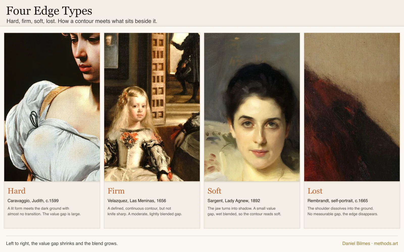
One warning comes straight from working over photographs. A camera inflates contrast and sharpens edges the eye would have softened, so copying an edge at the value the camera reports it will break the form. John Singer Sargent is the reference for the soft edge, a painter who let most of a head stay soft and spent his few hard edges where they counted. Caravaggio holds the hard end, Rembrandt the lost end where a contour dissolves into the ground and the head still reads. The four types sit on the composition charts, and edge control is where the finishing lesson does most of its work.
Complete, not finished
The last technique is knowing when to stop, and it has a definition. "Complete means when it doesn't need anything else." That is not the same as finished, because finished implies a certain polish, every form rendered out, and a picture can be polished to a high shine and still be overworked. Overworking is the easy mistake. The target is sufficiency. When the painting does not need anything else, you stop, even with a passage left frankly raw. Velazquez proved the point on one canvas, carrying a head to a finish while a smock beside it stays at the block-in, both true at once.
Getting there is mostly connecting, not separating. In the middle of a painting you break the head into local areas and solve them one at a time. At the beginning and the end you think holistically, and the end is where you bring those areas back into one thing, hunting the places where the form broke and building bridges across them. A finish runs as a chain, one adjustment prompting the next, until you no longer know what to adjust. That is usually the moment it is done. And nothing superfluous gets added, no information the picture did not actually need. Highlights in particular get rationed, reserved for the few brightest notes and never spread across a whole lit plane, because a plane painted at full highlight has nowhere left to go.
The hard part is that your own eye goes blind to a painting you have stared at for weeks. So the technique is to game your own perception. Finish to about eighty or ninety percent, then walk away for weeks and come back fresh. There is a trick under the walk-away worth stealing: calling a thing finished makes you suddenly see the faults in it. Say it is done, photograph it so it flattens to one image, and look as if you can no longer change it. The faults you could not see while making it will surface at once.
There is a clock under all of this. On the first day the paint is wet and the technique is adding, the big massing and the large moves. On the second day it has gone tacky, and the technique switches to adjusting, evening a shadow to one value and lifting the darkest darks without the brush picking the paint back up. Knowing which move the paint will allow on which day is most of what keeps a finish clean. The full pair of lessons is Complete, Not Finished and The Second Day.
FAQ
What techniques do portrait painters use? Realist portrait painters work through an order more than a set of tricks. They see the head as three value brackets before any color, find its shapes and proportions with the connected shadow shape as the anchor, light it with one decided source, mix flesh from a small balanced palette, model the planes of the face, and control which edges stay hard and which dissolve. The craft is doing them in that order, because each decision sets up the next and a portrait mostly fails in the early ones.
What palette do you use for portraits? A limited, balanced one. The Zorn palette handles most skin from four tubes: yellow ochre, ivory black, red, and white. A slightly longer version adds a real blue and more reach: burnt sienna, ultramarine, and yellow ochre as muted primaries, with permanent rose and phthalo green to push the cooler notes, plus lead white for luminous glazed skin and titanium white to cover flatly. Fewer tubes share more parents, which keeps the color harmonious. Decide the temperature of your light first, because flesh is a warm light cooling off the form with the shadow running the opposite way.
How do you start a portrait? With shapes, not features. Squint until the head collapses into a light family and a shadow family, and draw that border first. Get the big shapes, the distances, and the proportions right while they are still cheap to move, keeping the shadow shape as one flat value. Set your darkest dark and lightest light early so the range is fixed. Only once the flat shapes are trustworthy do you model form or chase a likeness. A portrait mostly fails in that first hour, not the last.
Should you use sight-size or comparative measurement? It depends on what you are painting. Sight-size sets the canvas beside the subject at the same apparent size and compares the two directly, which is unusually accurate for a still subject under fixed light in a deep studio. Comparative measurement builds everything from one chosen unit like the head, and it travels: a restless sitter, a plein-air afternoon, a wall-sized canvas. Most trained painters carry both and reach for whichever the situation hands them. The full comparison is in what is the sight-size method.
If you want a read on which of these disciplines your own work already leans toward, the free Artist Reading names the master painters closest to how you paint. The workshop that teaches this whole order, value through finish, opens August 22, and the waitlist hears first.
A portrait is not rescued in the last hour. It is decided in the first, in the shapes you trusted before you ever thought about form.
Written by Daniel Bilmes — painter and educator, Los Angeles. Methods.art is the online painting program built around developing your own process, not copying a house style. See the program or work with Daniel one-on-one.