Seeing in Three Values
The premise
A painting reads from across the room or it doesn’t. What carries at that distance is not color and not detail. It’s the pattern of values: which shapes are dark, which are light, and which sit between. So before anything else gets a vote, the whole value scale gets compressed into three brackets. Darks, mids, lights. Three families, and each has to hold together.
Holding together is the discipline. Daniel’s rule for the shadow side, from the Finishing Touches demo: “I like to keep my shadows flatter than the rest of the painting. And what I mean by flatter is one value.” A shadow with light scattered through it stops registering as shadow. So he hunts the strays down, “finding any of these little light pockets in the shadow and getting rid of them.”
And one line guards the border between the families. His tongue twister: “The lightest lights in the shadows should be darker than the darkest darks in the light.” Cross that line once and the two families start trading members. The eye sorts a picture into light and shadow before anything else. A shadow note that drifts into the light family gets filed as lit, and the form breaks at that spot. Keep the brackets honest and the picture reads at any distance.
The demonstration
Four figures carry the system; their order is the order of the work.
The first, The three-value thumbnail, collapses the full value scale into the three brackets, then reduces three famous compositions to thumbnails of exactly three values: Caravaggio’s Calling of Saint Matthew, Repin’s Barge Haulers on the Volga, Sorolla’s Strolling along the Seashore. You can still name every painting. That’s the point. The composition is the three-value pattern, and everything else rides on it.

The three-value thumbnail. It also sits on the composition charts.
The second, The three-value thumbnail, three more compositions, adds Velazquez’s Las Meninas, Rembrandt’s The Night Watch, and Sargent’s The Daughters of Edward Darley Boit, each at the painting’s true proportions (318 by 276 cm, 363 by 437, 222 by 222). The pattern belongs to a specific rectangle; the same three shapes in a different rectangle are a different composition. A thumbnail at a casual ratio teaches you the wrong painting.

The three-value thumbnail, three more compositions. It also sits on the composition charts.
The third, Value block-in, stage by stage, moves from deciding to painting. A head built as two flat value masses, then three, then four, then refined with turned edges. The thumbnail chose the pattern; the block-in enacts it on the panel in the same order. Big flat masses first, no modeling until they sit right. In Daniel’s words, “location first, then form and nuance.”

Value block-in, stage by stage. It also sits on the composition charts.
The last, Tonal relationships, value is relative, explains why the system works at all. The same mid gray reads lighter on a dark ground and darker on a light one, though the pigment never changes. A dark object in light can measure a higher value than a light object in shadow. A value only reads against its neighbors. So you manage relationships, not isolated notes. The tongue twister sits as that figure’s footer.

An original methods.art diagram. Swatches are sRGB values; the demonstration follows the academic teaching that a value is read in relation, not in the absolute.
Tonal relationships, value is relative. It also sits on the color charts.
The master’s example
Caravaggio commits most of his canvas to the dark bracket and lets one shaft of light carry the story. Rembrandt’s Night Watch and Sargent’s dark interior work the same dark field. Sorolla inverts it: a field of light with the darks reduced to small anchors. Velazquez holds the lit group inside the dark room. Harold Speed called Las Meninas the first picture “founded entirely on visual appearances,” outline replaced by “a structure of tone masses.”
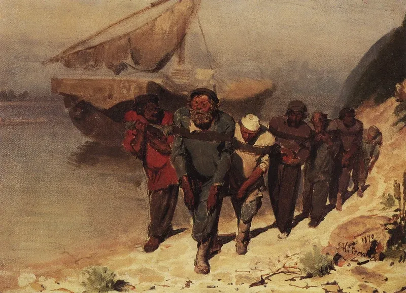
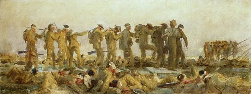
Repin proves the pattern comes first in time. His own 1870 oil study for Barge Haulers on the Volga (State Russian Museum) already holds the whole team as one dark line dragged across pale sand and water. The final canvas took until 1873; the pattern never changed. Sargent did the same half a century later. His 1918 oil study for Gassed masses the file of blinded soldiers into one long tonal frieze, and the wall-sized 1919 mural scales it up without re-deciding it. Both studies hang under the thumbnail figures. Painters who could render anything did their deciding at three-value size.
The exercise
Two parts, one kitchen table.
Part one is Harold Speed’s exercise in mass drawing, from The Practice and Science of Drawing (1913), chapter IX, Mass Drawing: Practical. His premise is the bracket system in one sentence: “Most objects can be reduced broadly into three tone masses, the lights (including the high lights), the half tones, and the shadows.” Condensed from his steps:
- One simple pale object. Speed used a plaster cast; a white mug or an egg on a plain cloth does the job. Light it with a lamp from the right or left, never from the front. Artificial light, he notes, is less subtle, and therefore easier.
- In charcoal, block the shapes of the shadows “in square lines,” in true proportion to each other, “troubling about little else.” Scaffolding, not a drawing.
- Mix raw umber and white to match the half tone; scumble it thin over the whole surface.
- Mix the tone of the lights and map the light shapes into it, watching where an edge stays sharp and where it melts. Thicker paint reads lighter; thinner sinks toward the half tone.
- Mix the darkest shadow tone and map the shadows the same way.
- Set the study beside the object and walk back. Speed: “Faults that are not apparent when close, are easily seen at a little distance.”
One sitting, one to two hours. No oils? Charcoal and white chalk on toned paper works; the paper is the half tone. When you can’t tell which bracket a passage belongs to, use the device Speed gives in his chapter on unity of mass: half close your eyes. The halftones fall away; the masses declare themselves.
Part two is Daniel’s version: three-value thumbnails of famous paintings at true proportions. Pencil, or one brush and raw umber. Rule the rectangle first, true to the original’s ratio, two or three inches on the long side. Give every part of the rectangle one of exactly three values. No fourth value, no hedging at the borders. The standard is his line: “as accurate as necessary, not as accurate as possible.” Ten to fifteen minutes each. Do three from the figures above, then one from a painting you love. What to look for: held at arm’s length beside a postcard-size image of the painting, the thumbnail should read as the same picture. Then count how much of the rectangle each bracket covers. Never even thirds; the painting leads with one family.
Self-check
- Squinted at, your study falls into three flat shapes. Any passage you can’t assign to a bracket is a decision you haven’t made yet.
- “The lightest lights in the shadows should be darker than the darkest darks in the light.” Find your lightest note inside the shadow and your darkest note in the light. Compare them.
- The shadow reads as one value. Any light pockets left inside it are ones you chose, not ones the brush left behind.
- One bracket dominates the rectangle. Even thirds means the pattern has no lead.
- The thumbnail’s rectangle matches the painting’s true proportions, and the pattern still reads from across the room.