The Zorn palette is four pigments: yellow ochre, ivory black, vermilion, and lead white. Ivory black does the work of blue here. Mixed with white it reads cool against the warm ochres and reds beside it, so simultaneous contrast stands in for chromatic range. Zorn toned the canvas a gray-red, painted standing under a north window, and loaded large hog-bristle brushes straight from the tube. No medium, no glazing. White was held back for the final highlights.
Worked the famous discipline of ivory black, yellow ochre, vermilion, and lead white — using ivory black mixed with white as a functional substitute for blue, since cool gray reads as blue against neighboring warm ochres and vermilions.
Why it matters · The palette works on simultaneous contrast, not on pigment range. Most painters reach for more colours when a painting fails; Zorn argued the opposite — restriction forces the painter to use value relationships honestly. The four-tube discipline reveals which paintings actually depended on colour and which depended on value.
Emma Jansson, Making in Context: Reconsidering Anders Zorn's Oil Painting Practice, 2022
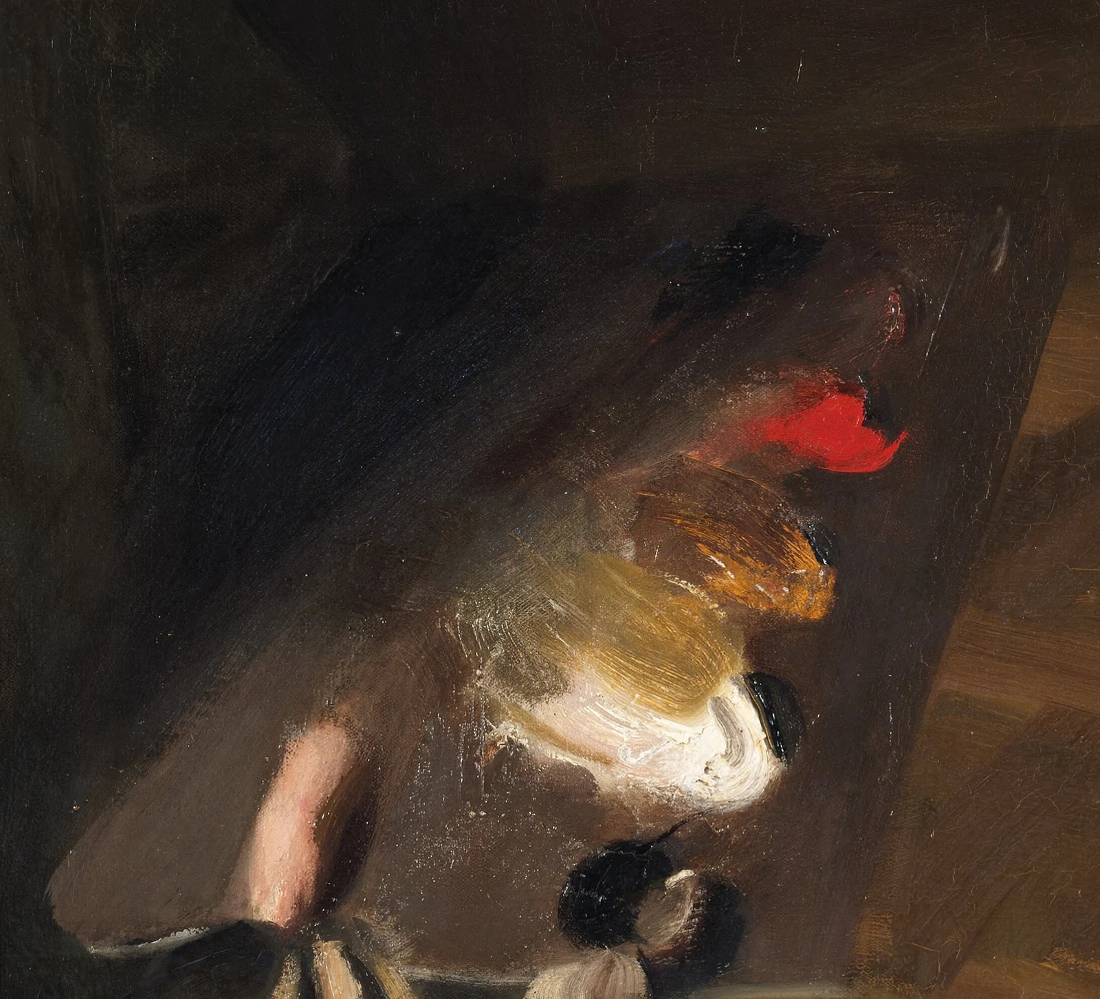
Detail of Self-Portrait with a Model: the palette he holds carries the whole argument, one bright note of vermilion, a pile of yellow ochre, black, and white, the four pigments the portraits were built from.
Anders Zorn, Self-Portrait with a Model (detail), 1896, Nationalmuseum, Stockholm. Public domain, Wikimedia Commons.
Tone the canvas with red-and-black
Tinted his canvas ground with a mixture of ivory black and a small amount of vermilion before the first mark — the red strengthened the paint film and prevented the black from cracking.
Why it matters · A black ground is a structural risk; a black-and-red ground is a structural decision. The gray-red tone allowed Zorn to judge both highest highlight and deepest shadow against a stable middle value from the very first stroke. Painters who work on white have to mix back to that middle value with every passage.
Emma Jansson, Making in Context, 2022
Place the transition, do not blend it
Mixed specific intermediate tones and placed them as discrete strokes between light and dark masses — never blended the light-shadow edge with a clean brush.
Why it matters · Blending produces mud. Placing the transition as painted steps preserves the clarity of each value. This is the technical core of Zorn's skin rendering. Painters who reach for the soft brush at every halftone collapse their value structure.
Stand and walk back to judge
Worked standing at the easel and walked back and forth between painting and subject — the same retreat-and-place rhythm Sargent practiced. Tilted the wooden palette against the window to kill glare.
Why it matters · A painter cannot judge a mark from eighteen inches away. Zorn's standing-and-walking practice is the cleanest case in late-19th-century portraiture for the body as the rangefinder. The palette tilt is a small habit but methodological — colour mixed under glare reads wrong.
Work alone, daily, with rituals as part of the painting
Standardised solitary working hours; preparation of palette and cleaning of brushes treated as part of the work, not as setup. Wrote that "the rituals and routines of how I do my work are as important as the art itself."
Why it matters · A practice without ritual is a practice without consistency. Zorn's schedule made consistency the precondition of virtuosity. Painters who treat preparation as administrative overhead lose the priming effect that fixed routines deliver.
Anders Zorn, Självbiografiska anteckningar (Autobiographical Notes), 1910
Reduce to two values before any nuance
Simplified the subject into a single light mass and a single dark mass, organised by one source of light (typically the north window), before any colour mixing.
Why it matters · The entire tonal structure of the painting is resolved at this binary level before nuance arrives. Painters who chase nuance before structure end up with paintings that look detailed but read flat. The two-value reduction is the skeleton.
Spend the one saturated red
Vermilion is the only saturated color on the four-tube palette, so Zorn spent it deliberately: a small note of pure red at a focal point (a lip, a cheek, a ribbon, a pin) in an otherwise muted field of ochre and gray.
Why it matters · When everything else is low-chroma, one saturated mark carries the whole eye. A painter learns more about leading attention from rationing a single bright pigment than from a full spectrum where nothing stands out. The constraint makes the placement deliberate instead of decorative.
Technical analysis of the Zorn palette; the pattern is visible across Zorn's self-portraits
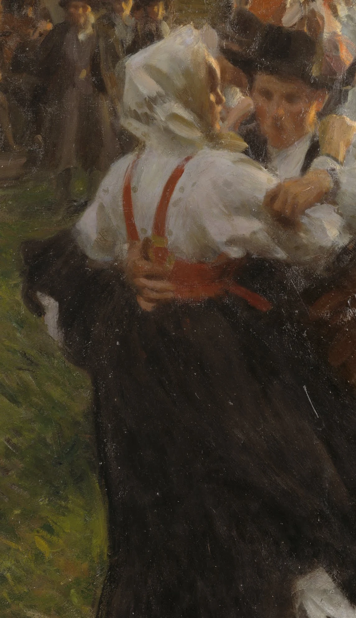
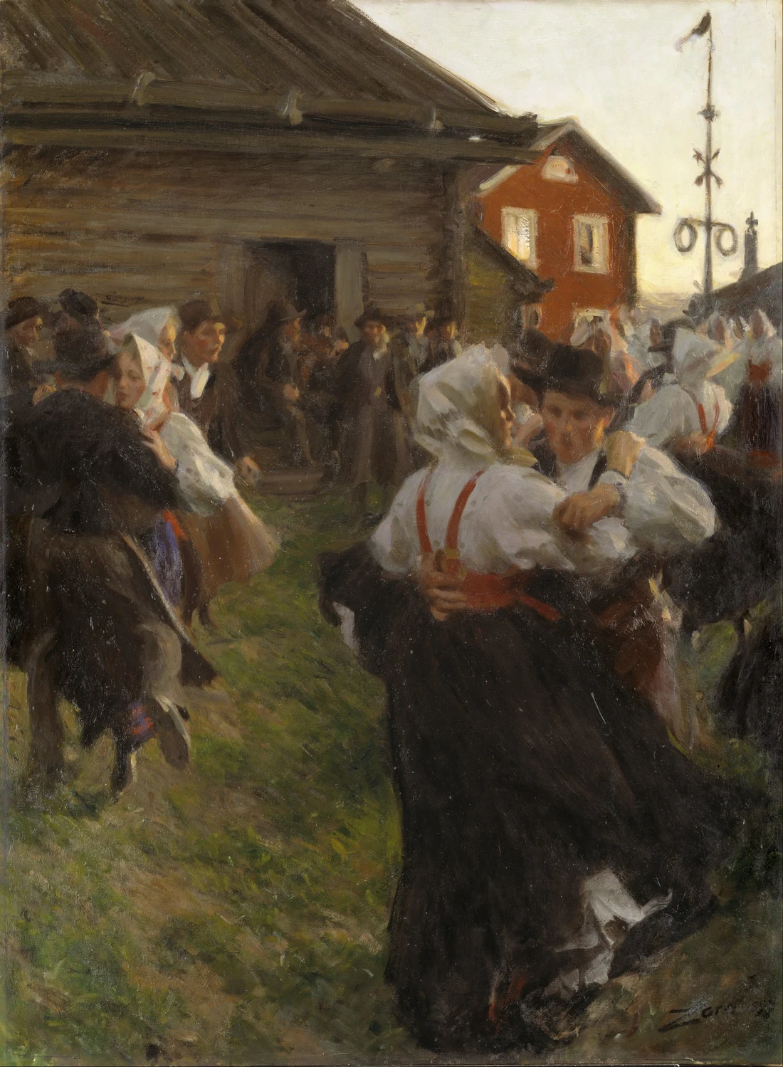
Detail of Midsummer Dance: in a field of white linen, black wool, and green grass, the one saturated note is the red of the braces and sash on the dancing woman, the single pure red spent where the eye should land.
Anders Zorn, Midsummer Dance (detail), 1897, Nationalmuseum, Stockholm. Public domain, Wikimedia Commons.
In the studio
Anders Zorn with his wife Emma, photograph, 1880
Studio
Light
Large north-facing window in the Mora studio (Dalarna, Sweden), designed by Zorn around the window itself. Stable light across the working day.
Position
Standing at the easel; walked back and forth between painting and subject. Wooden palette tilted against the window to kill glare.
Session length
Long solitary working hours, daily, with standardised schedule and ritualised preparation.
Tools
Large hog-bristle brushes loaded with paint straight from the tube · Traditional wooden palette held in hand, tilted against window light · Charcoal sticks for the working drawings he called his "graphic diary" · Etching tools (he was a world-class etcher and used etching as compositional rehearsal)
Notes
Inventories of his studio after his death recorded seventeen tubes of cobalt blue along with viridian, cadmium yellow, and other pigments — used in watercolours, etchings, and some landscape work. For the portraits that built his reputation, the four-colour discipline held.
Source: Zorn Collections (Zornsamlingarna), Mora, Sweden
Palette
Ground
Mid-value tinted ground — ivory black plus a small amount of vermilion. The red strengthened the paint film and prevented the black from cracking.
Whites
Lead white (reserved for final highest highlights only — premature white in the mid-tones produces a chalky, milky surface that cannot be recovered)
Earths
Yellow ochre
Colors
Vermilion
Blacks
Ivory black (used not as a darkener but as a functional substitute for blue)
Medium
Pure oil. No mediums during painting. Same no-medium discipline as Sargent and Sorolla.
Quantity
Generous. Set out colours as "mother piles" on the far edges of the palette, preserving a large empty mixing area in the centre. Built graduated "value strings" — lines of paint mixed from dark to light — for placing a specific value without re-mixing it each time.
Source: Emma Jansson, Making in Context, 2022
The palette, charted
Zorn palette chart: the four pigments Zorn worked from, lead white, yellow ochre, vermilion, ivory black, with the mixes they reach.
Three painters' palettes compared in three rows: Zorn's four colors (lead white, yellow ochre, vermilion, ivory black), which take their cool notes from black set beside the warm colors with no blue tube; the Bilmes five, three muted primaries (burnt sienna, ultramarine, yellow ochre) plus permanent rose and phthalo green to push the cools; and Reilly's nine-value neutral gray string that fixes every color to a value first, all three balancing a short set of primaries to open a wide range of harmony. Zorn's four are the documented core he showed in his 1896 self-portrait, and his studio tubes and modern analysis (Jansson 2022) add cobalt blue and viridian in specific works.
Mid-value wash of ivory black and vermilion across the whole canvas before the sitter arrived.
Why: Establishes the working middle value as a precondition. Lights and shadows have a stable reference from the first mark.
2. Linear block-in
Mapped major shapes and shadow lines using the same red-black mixture thinned to a wash. Ochre and white kept out of the palette at this stage.
Why: The darks must remain transparent. Loading them with white at this point produces a painting that fights its own structure.
3. Reduce to two values
Simplified the subject into a single light mass and a single dark mass, organised by one source of light.
Why: Tonal structure resolved at the binary level before any nuance. Skipping this stage produces paintings that look detailed but read flat.
4. Paint the transition as discrete strokes
Mixed intermediate tones and placed them as discrete strokes between light and dark masses. No blending.
Why: Blending produces mud. Placed transitions preserve value clarity. This is the technical core of the skin rendering.
5. Lights established with ochre and white
Built lit masses from yellow ochre mixed with white. Neutralised with ivory black if too chromatic, warmed with vermilion if too yellow.
Why: The full portrait exists in resolved colour at this stage. The corrections are made through the four-tube discipline, not by reaching for new pigments.
6. Final highlights — small and thick
Pure white or high-value mixtures placed last as small thick marks — pupil, glint on a nostril, edge of a collar, light on jewellery.
Why: A painting is finished when the impression of the sitter is captured. Peripheral passages can remain loosely suggested rather than brought to the same level of finish.
How they studied
Zorn trained against the grain. He entered the Royal Swedish Academy of Arts in Stockholm at fifteen, in 1875, and quickly found its drawing-from-casts curriculum outdated; his attendance fell off, and he later said he had not had much to learn there. He became a leader of the students who called themselves the Opponents, and after a clash with the Academy over its rigid teaching he left. What actually formed him was watercolour. After an exhibition by the Swedish watercolourist Egron Lundgren he threw himself into the medium, and the 1880 sheet In Mourning, shown at the Academy students' exhibition, brought his first commissions; he worked almost only in watercolour until 1887. The oils came later and mostly self-taught, begun over the winter of 1887 to 1888 at St Ives in Cornwall, where he carried the transparency and the decisive placement of the watercolours straight into the new medium. The two sheets below come from those watercolour years, the breakthrough portrait and an ambitious field picture from the height of the practice.
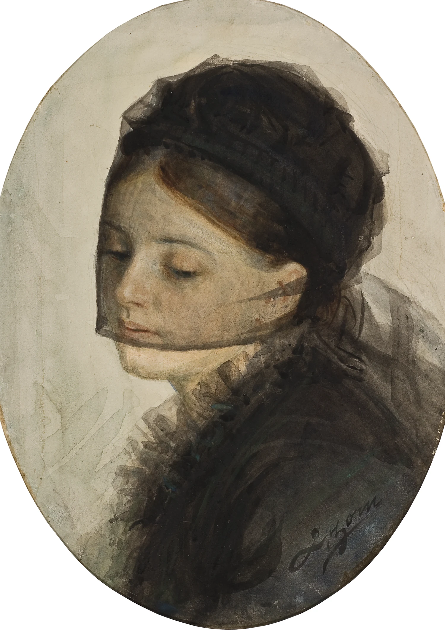
In Mourning, 1880: a young woman in a black mourning veil, the picture Zorn showed at the Academy students' exhibition that brought his first portrait commissions. He was twenty, and still working almost entirely in watercolour.
Anders Zorn, In Mourning, 1880, Nationalmuseum, Stockholm. Public domain, Wikimedia Commons.
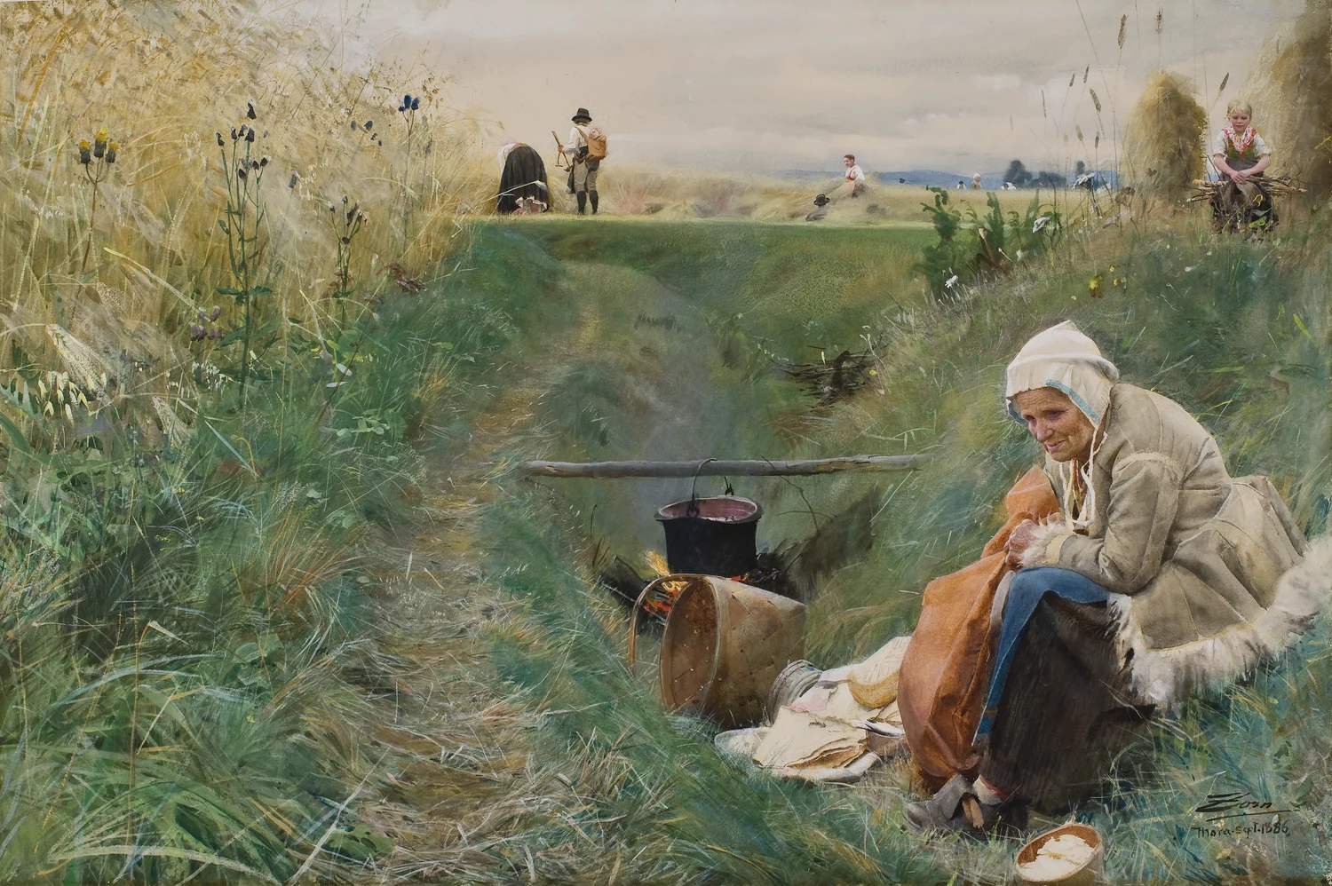
Our Daily Bread, 1886: an old woman tending a pot over a fire in a ditch while the harvest goes on behind her, a large and ambitious watercolour from the years before Zorn took up oil. He set out to paint the field and the ditch where he had played as a child.
Anders Zorn, Our Daily Bread, 1886, Nationalmuseum, Stockholm. Public domain, Wikimedia Commons.
Source: Formation and the watercolour-first training: Anders Zorn, Självbiografiska anteckningar (Autobiographical Notes), and the Zorn Collections (Zornsamlingarna), Mora.
Up close
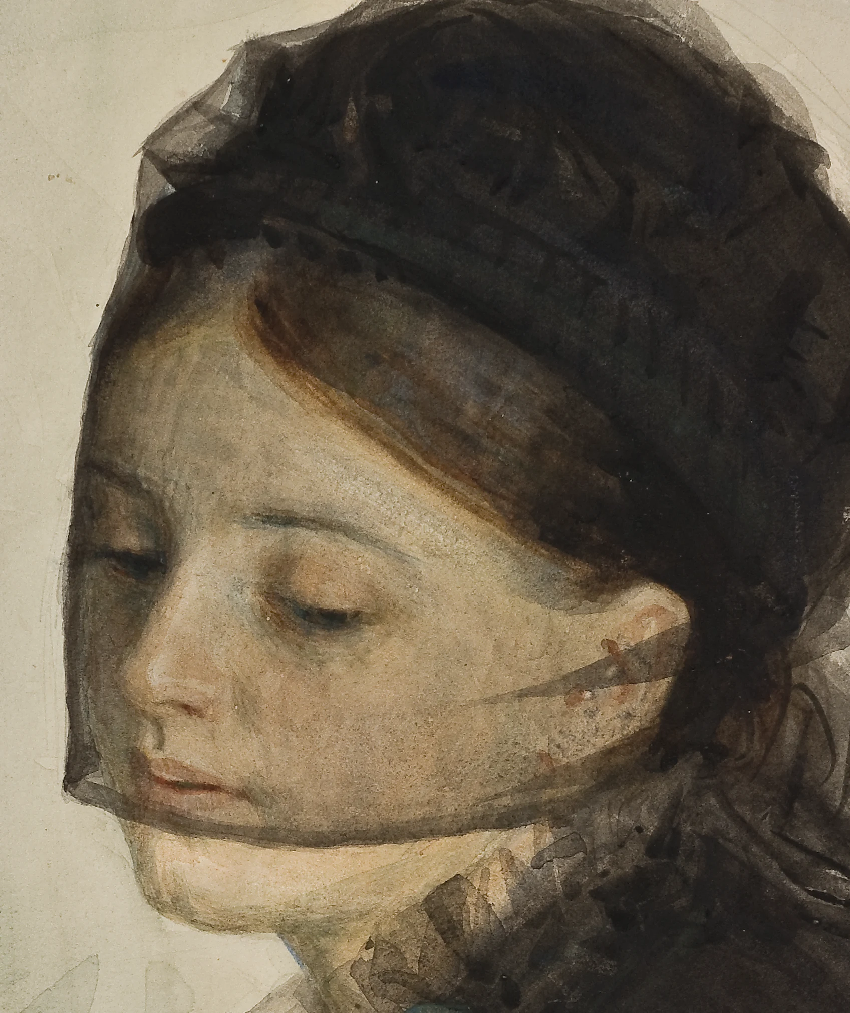
Detail of In Mourning: the black mourning veil is one transparent wash laid straight over the finished face, dark enough to read as gauze yet thin enough that the lit cheek and brow show through it. This is the watercolour Zorn made his name on.
Anders Zorn, In Mourning (detail), 1880, Nationalmuseum, Stockholm. Public domain, Wikimedia Commons.
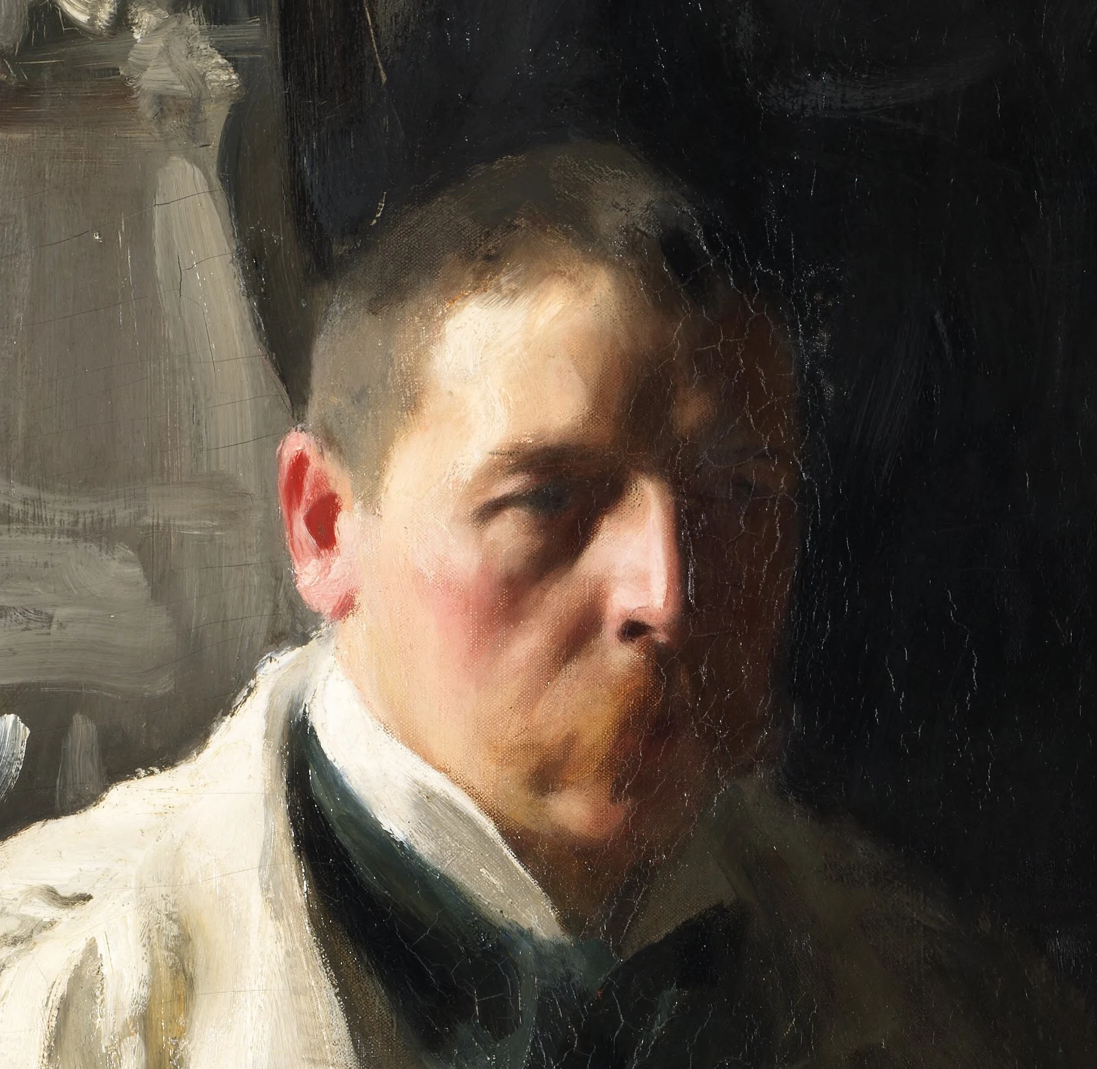
Detail of Self-Portrait with a Model: the face is built in placed strokes, the lit cheek and the shadow side set as separate touches with the transition stated rather than smoothed, the whole head carried on ochre, vermilion, black, and white.
Anders Zorn, Self-Portrait with a Model (detail), 1896, Nationalmuseum, Stockholm. Public domain, Wikimedia Commons.
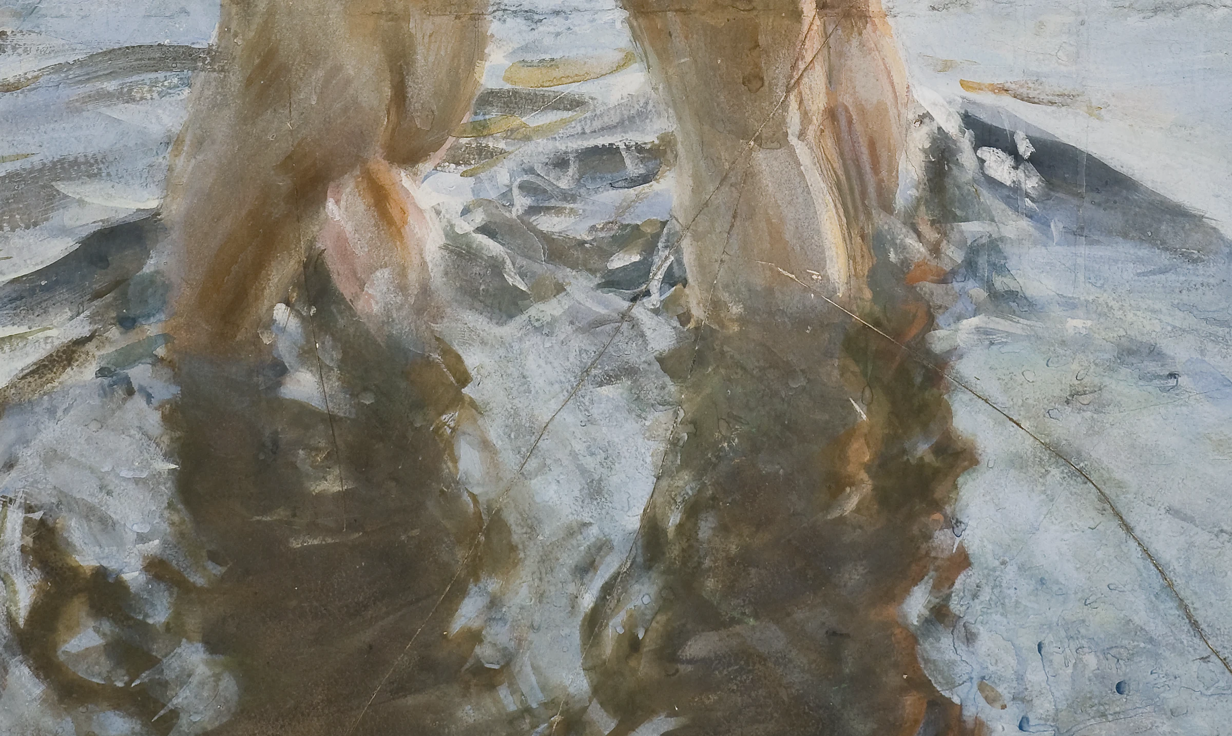
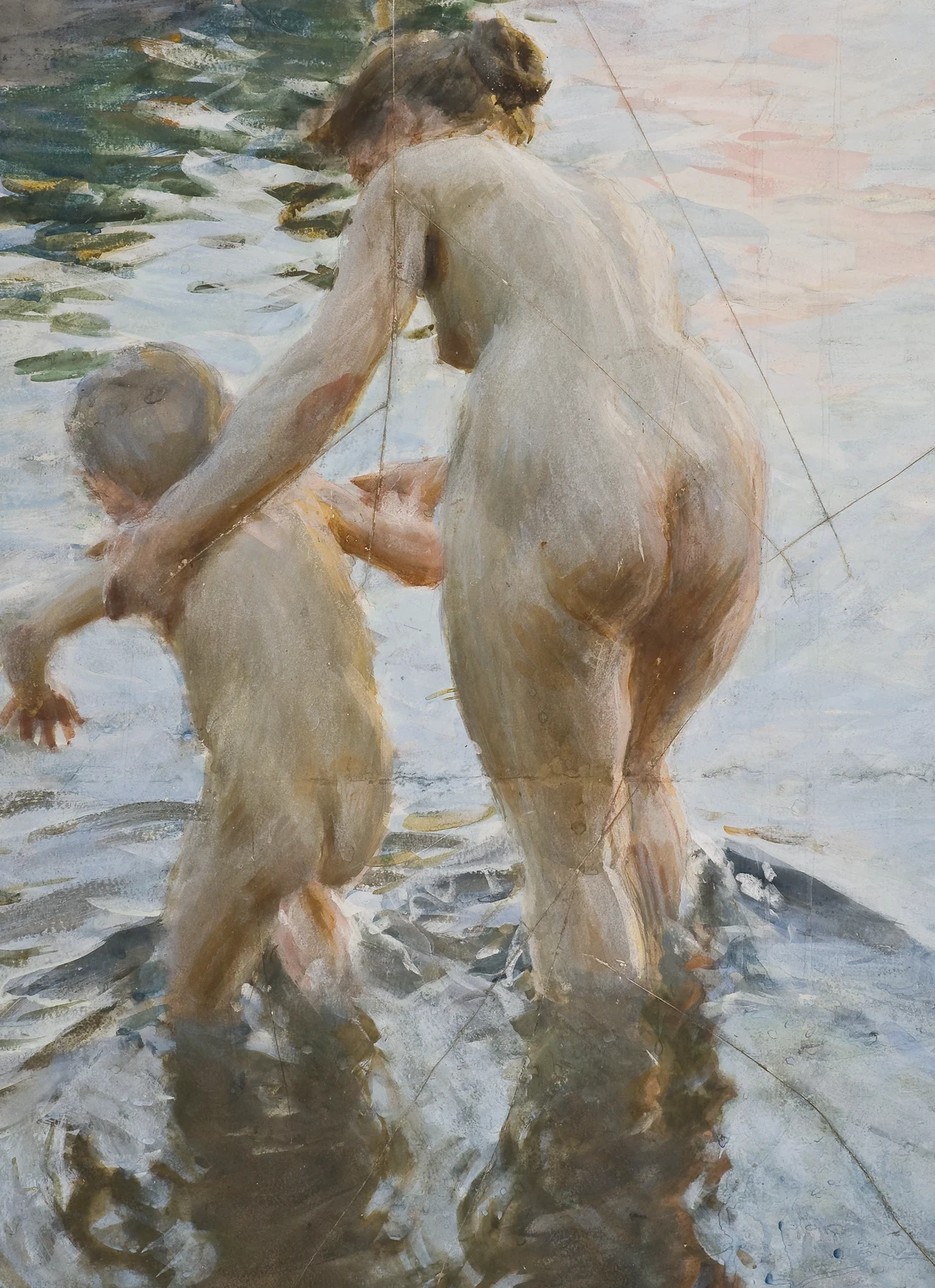
Detail of A Premiere: the shallow water is laid in broken strokes of grey, green, and warm brown, and the wading figures break into a wavering reflection under their feet. Reflection on moving water was a problem Zorn set himself again and again.
Anders Zorn, Une premiere (A Premiere) (detail), 1888, Nationalmuseum, Stockholm. Public domain, Wikimedia Commons.
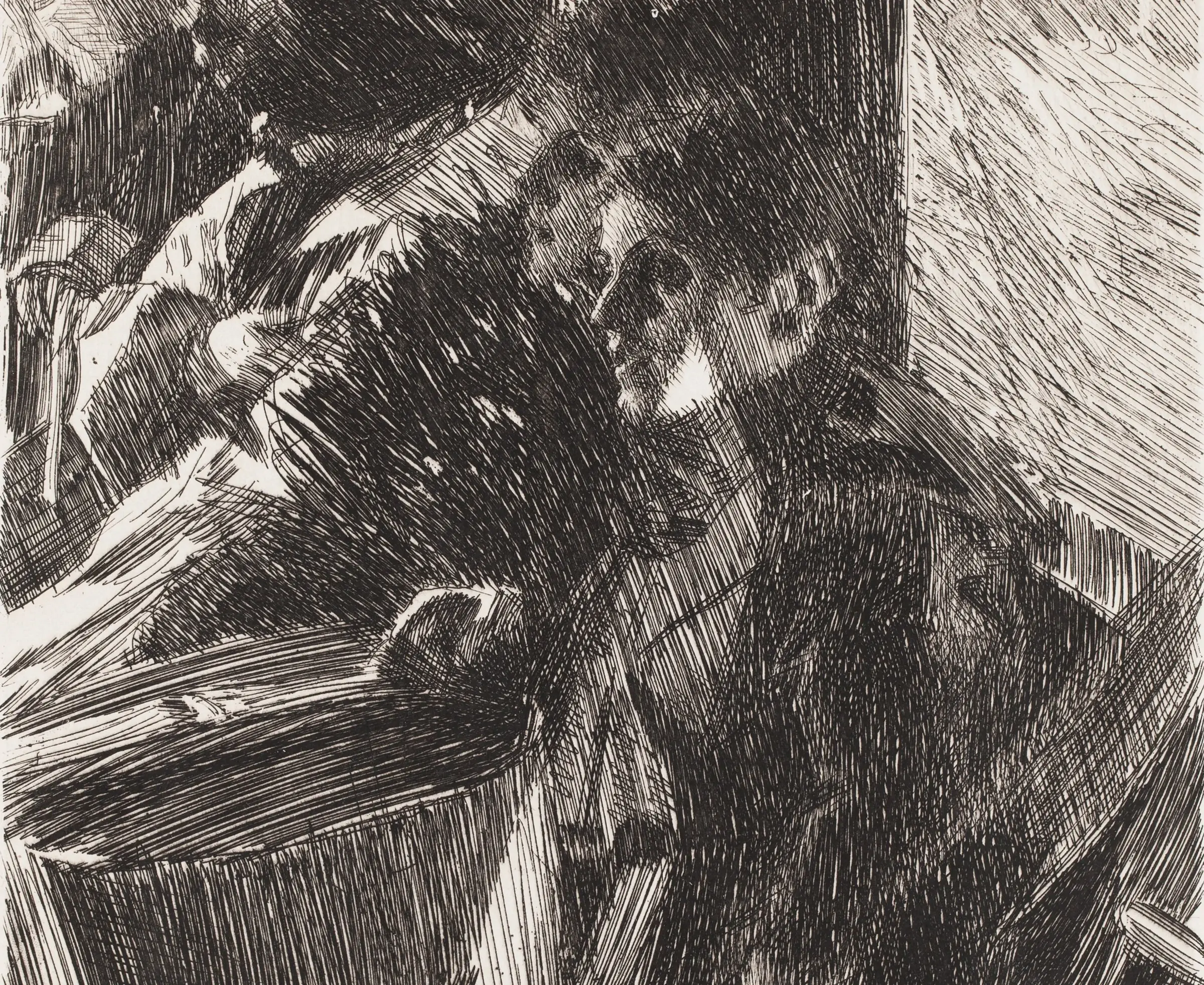
Detail of Omnibus: the whole car of passengers is built from nothing but etched lines, parallel strokes swelling into shadow and thinning toward the light, the faces found in the gaps left between the hatching. Zorn cut close to three hundred plates over his life.
Anders Zorn, Omnibus (etching, detail), 1892. Public domain, Wikimedia Commons.
Watching him work
“The distinguished Swedish artist, Zorn, uses but two colors, vermilion and yellow ochre; his two other pigments, black and white, being the negation of color.”
Une premiere, a watercolour of 1888: two figures wading out into a lake at dusk, the pink of the sky and the green of the deep water carried in transparent washes, the bare paper kept for the brightest skin. The reputation Zorn built first was as a watercolourist.
Anders Zorn, Une premiere (A Premiere), 1888, Nationalmuseum, Stockholm. Public domain, Wikimedia Commons.
Midsummer Dance, oil, 1897: couples turning on the grass in the pale all-night light of a Swedish midsummer, the red cottage and the maypole behind them. The picture that fixed his reputation at home as the painter of Dalarna.
Anders Zorn, Midsummer Dance, 1897, Nationalmuseum, Stockholm. Public domain, Wikimedia Commons.
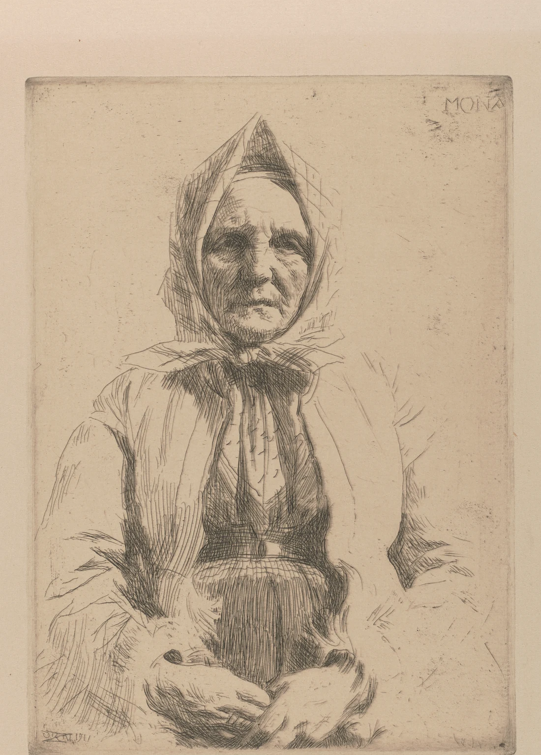
Mona, an etching of 1911: Zorn's mother, Grudd Anna Andersdotter, in a headscarf with her hands folded, the deeply lined old face built from close etched hatching against the bare paper. He learned to cut a line as a boy carving wood.
Anders Zorn, Mona (etching), 1911, Boston Public Library. Public domain, Wikimedia Commons.
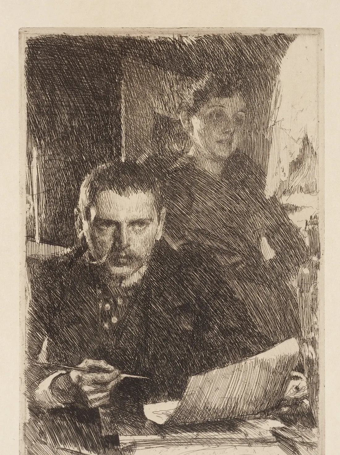
Zorn and His Wife, an etching of 1890: the painter in front with the needle still in his hand, his wife Emma behind him, the two of them cut out of a storm of parallel lines. Etching was the parallel craft he kept up his whole life.
Anders Zorn, Zorn and His Wife (etching), 1890. Public domain, Wikimedia Commons.
The record, deeper
The materials
The four-colour palette was the portrait discipline, not the whole kit. Modern technical study of his oils by Emma Jansson found cobalt blue and viridian in specific paintings, among them the 1915 Self-Portrait in Red, laid into foundations and mixtures the four tubes could not reach.
Emma Jansson, Making in Context: Reconsidering Anders Zorn's Oil Painting Practice, 2022.
The physical evidence sits in the Zorn Museum in Mora, which keeps seventeen tubes of cobalt blue from his studio along with viridian and other pigments among the tubes he left behind.
Zorn Collections (Zornsamlingarna), Mora; Emma Jansson, Making in Context, 2022.
Beyond the portrait four, Jansson's analysis names zinc white, cadmium yellow, burnt sienna, madder lake, and ultramarine among the pigments Zorn used across the oils, watercolours, and landscape work.
Emma Jansson, Making in Context, 2022.
Refusals — what they would not do
Refused colour-range chasing — held to the four-pigment palette for portraits.
Refused white grounds — toned every canvas with red-and-black.
Refused to blend the light-shadow edge — placed transition strokes instead.
Refused mediums during painting — pure tube oil only.
Refused to load white into the mid-tones — reserved it for final highlights.
Reference
Primary source
Live sitters in the studio under stable north light. Outdoor subjects (Dalecarlian lake bathers, Mora villagers, Paris river scenes) painted directly from the actual environments.
Photography
Used as a secondary tool — for freezing the motion of water in his bathers and capturing complex figure gestures in motion. Aware of the difference between camera monocular lens and painter binocular vision; treated photography as a strict mentor for specific mechanical questions, not as a replacement for direct observation.
Exceptions
Drew constantly in charcoal — described his drawings as "truer than truth itself" and used them as reference for the postures and emotional registers of larger paintings.
Used etching as compositional rehearsal — the reversed monochrome logic of a copper plate forced him to resolve value and composition before committing to oil.
Royal Swedish Academy of Arts, Stockholm · 1875–1880 — Watercolor-centered formal training. International reputation first established in watercolor during the 1880s before the move into oil in the mid-1880s; the watercolor habits — transparency in the darks, economy of layer, decisive placement — carried into the mature oil method.
Influences
Velázquez and the late-Spanish tradition of restrained tonal portraiture against tinted ground.
Sargent (contemporary peer) — the standing-and-walking studio rhythm and the no-medium direct-oil discipline.
Students
No formal atelier. Influence ran through exhibition, reputation, and the American collectors who brought him to the United States to paint three U.S. presidents and a generation of industrialists.
The Zorn Palette has been codified in twentieth- and twenty-first-century atelier teaching — most prominently at the Watts Atelier — as a foundational exercise.
In their own words
“The rituals and routines of how I do my work are as important as the art itself.”
— Anders Zorn, Autobiographical Notes, 1910
“Practicing my craft every day in or out of the studio has become second nature to me. A way of life in which there is no boredom.”
— Anders Zorn, Autobiographical Notes, 1910
“Develop a consistent work habit. Spend many hours alone in the studio.”
— Anders Zorn, Recorded advice to younger painters
Zorn worked his portraits from four pigments: yellow ochre, ivory black, vermilion, and lead white. He used ivory black mixed with white as a substitute for blue, since the cool gray reads as blue against the neighboring warm ochres and vermilions.
What medium did Anders Zorn use?
Zorn painted in pure oil with no mediums during painting, the same direct-oil discipline as Sargent and Sorolla. He used no glazing.
What brushes and tools did Anders Zorn use?
Zorn used large hog-bristle brushes loaded with paint straight from the tube, and a traditional wooden palette held in hand and tilted against the window to kill glare. He also kept charcoal sticks for working drawings and etching tools for compositional rehearsal.
What ground did Anders Zorn paint on?
Zorn toned every canvas with a mid-value ground of ivory black plus a small amount of vermilion before the first mark. The red strengthened the paint film and kept the black from cracking, and the gray-red tone gave him a stable middle value to judge highlights and shadows against.
How did Anders Zorn paint skin tones?
Zorn mixed specific intermediate tones and placed them as discrete strokes between the light and dark masses rather than blending the light-shadow edge with a clean brush. Placing the transition this way preserved the clarity of each value instead of producing mud.
How did Anders Zorn mix green?
There is no green on the Zorn palette. Green is mixed from yellow ochre and ivory black, where the cool black acts as a complement to the warm ochre and produces a natural olive green. White is added to lighten that mixture up through the value range.
Did Anders Zorn use blue?
Mostly not. In his portraits Zorn used ivory black mixed with white in place of a blue, since the cool gray reads blue against the warm ochres and reds beside it. He did keep real blue for water, sky, and landscape work: the inventory of his Mora studio recorded seventeen tubes of cobalt blue among the 243 tubes of paint left behind.
What was Anders Zorn's watercolor technique?
Zorn fixed the composition in his mind first, then laid it down fast. He worked wet-into-wet for soft passages, reserved the white of the paper for his highlights rather than painting white in, and was unusually willing to push bold dark values for contrast. His international reputation was built on watercolor in the 1880s before he moved fully into oil.
If this painter is your match
You share the intuition that constraint is a source of range. The painter who can mix everything from four tubes is not smaller than the painter with thirty — usually larger.
Borrow this: Run the Zorn palette for one month: flake white, yellow ochre, vermilion, ivory black. Tone your canvas with a thin wash of ivory black and a small amount of red. Paint a portrait from a north window. You will find out which of your paintings actually depended on color and which depended on value.
Anders Zorn, Självbiografiska anteckningar (Autobiographical Notes), 1910. Zorn's own unfinished memoir, published posthumously by the Zorn Museum in Mora. The primary first-person source on his studio habits, travels, and working philosophy.
Zorn Collections (Zornsamlingarna), Mora, Sweden. Zorn's home, studio, and personal archive, preserved as a museum by his widow Emma Zorn. Holds his pigments, brushes, working canvases, correspondence, and studio inventory.
Emma Jansson, Making in Context: Reconsidering Anders Zorn's Oil Painting Practice, 2022. Scientific investigation of Zorn's grounds, pigments, and layer structure using X-ray fluorescence and cross-section analysis. Confirms the working palette and documents the red-black ground.